ParkinsonNL — Facts That Create Urgency

the brief
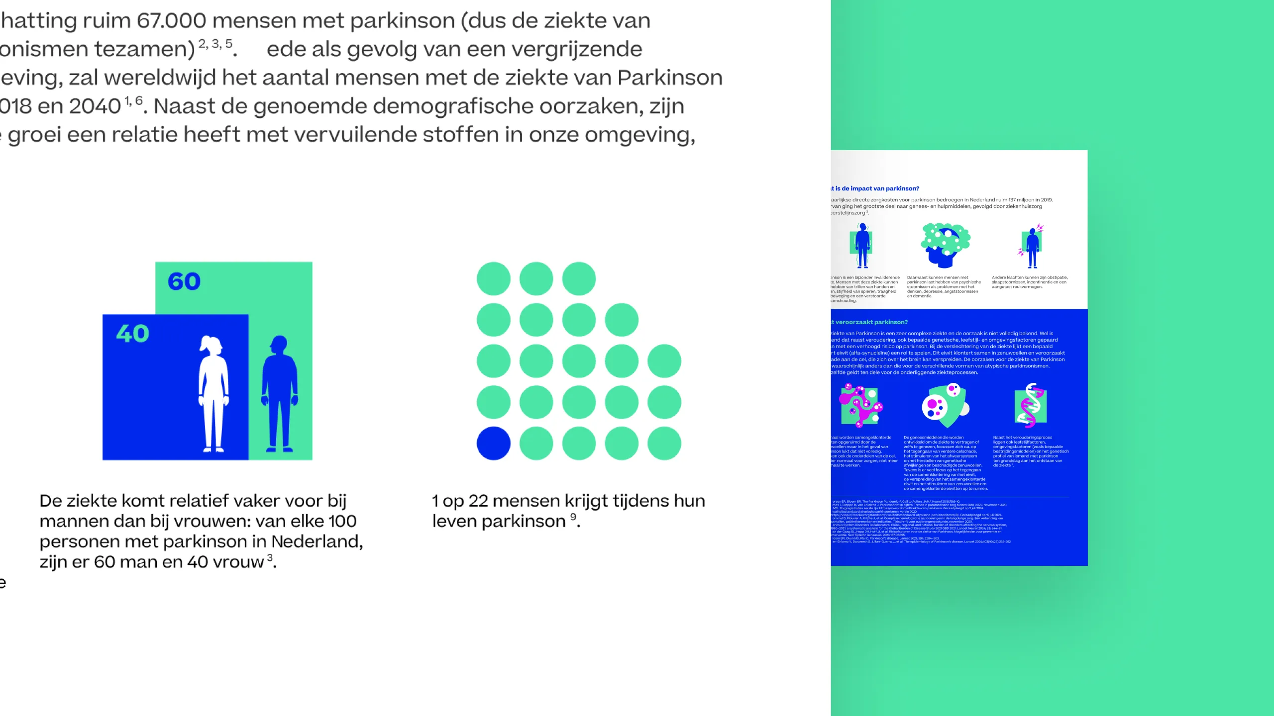
Parkinson's disease affects more people than most realise — and awareness is itself a form of advocacy. The factsheet had to communicate key statistics quickly and compellingly: 1 in 22 people will develop Parkinson's, more men than women, predominantly over 80 but a quarter of cases under 65. The goal was not just to inform, but to make the scale of the disease felt — and with it, the urgency for research funding.
DTP & information architecture
The layout was built within the ParkinsonNL brand framework, working with existing illustrations and supplied assets. The constraints were real: text lengths couldn't be equalised, and visual hierarchy was fixed. The design work was therefore about making the most of what was there — finding rhythm and clarity within a rigid structure.
icon design
The icons were designed from scratch, built on the geometry and existing animations of the ParkinsonNL identity. Recurring geometric forms appear in different configurations across the set, creating visual consistency without repetition. A deliberate choice was made to introduce neon colour accents against the brand palette — activating, high-contrast, and unexpected. Almost every icon carries a depth effect: shadow, layering, dimension. In a brand system that is otherwise largely flat, this gives the factsheet a sense of weight and presence.
→ Design decision: A one-dimensional visual language can still carry depth — literally. The depth effect on the icons does what the brand guidelines alone couldn't: it makes the information feel three-dimensional and alive.
what could be stronger
The text balance across sections remains uneven — a constraint of the brief rather than the design. With more editorial freedom, the hierarchy could be tightened to better guide the reader through the statistics in order of urgency.