Royal FloraHolland — The People Behind the Brand

the brief
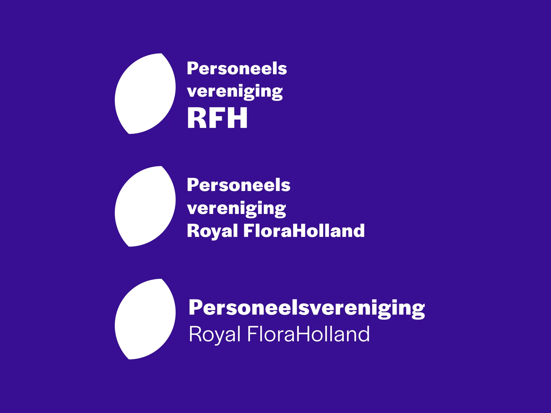
Royal FloraHolland's staff association needed its own visual identity — recognisably connected to the RFH parent brand, but with a distinct character. The association is made up of the people who are the heart of the organisation. That became the conceptual anchor: not a derivative of the corporate mark, but a symbol of what the organisation is actually built from.
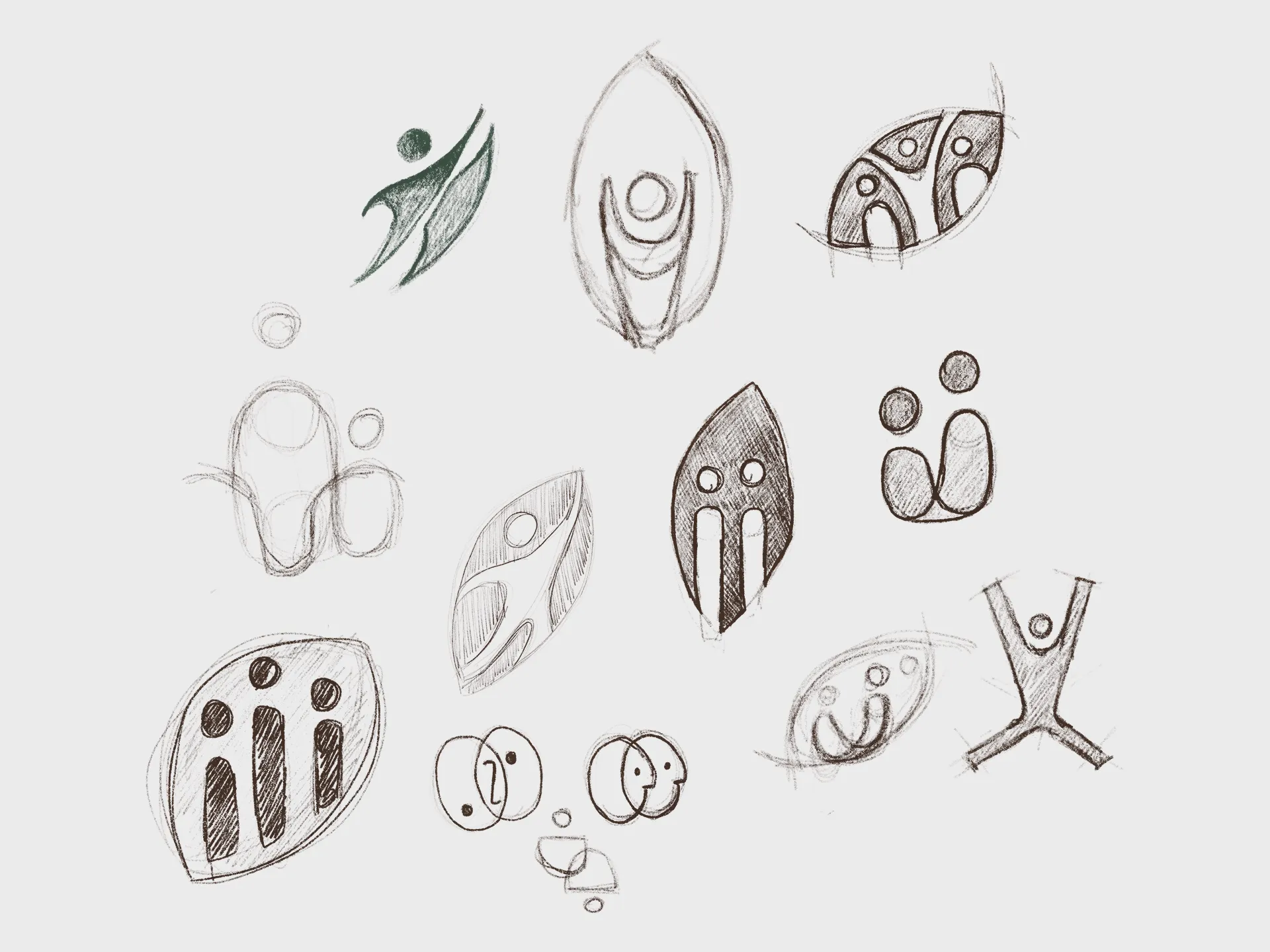
the process
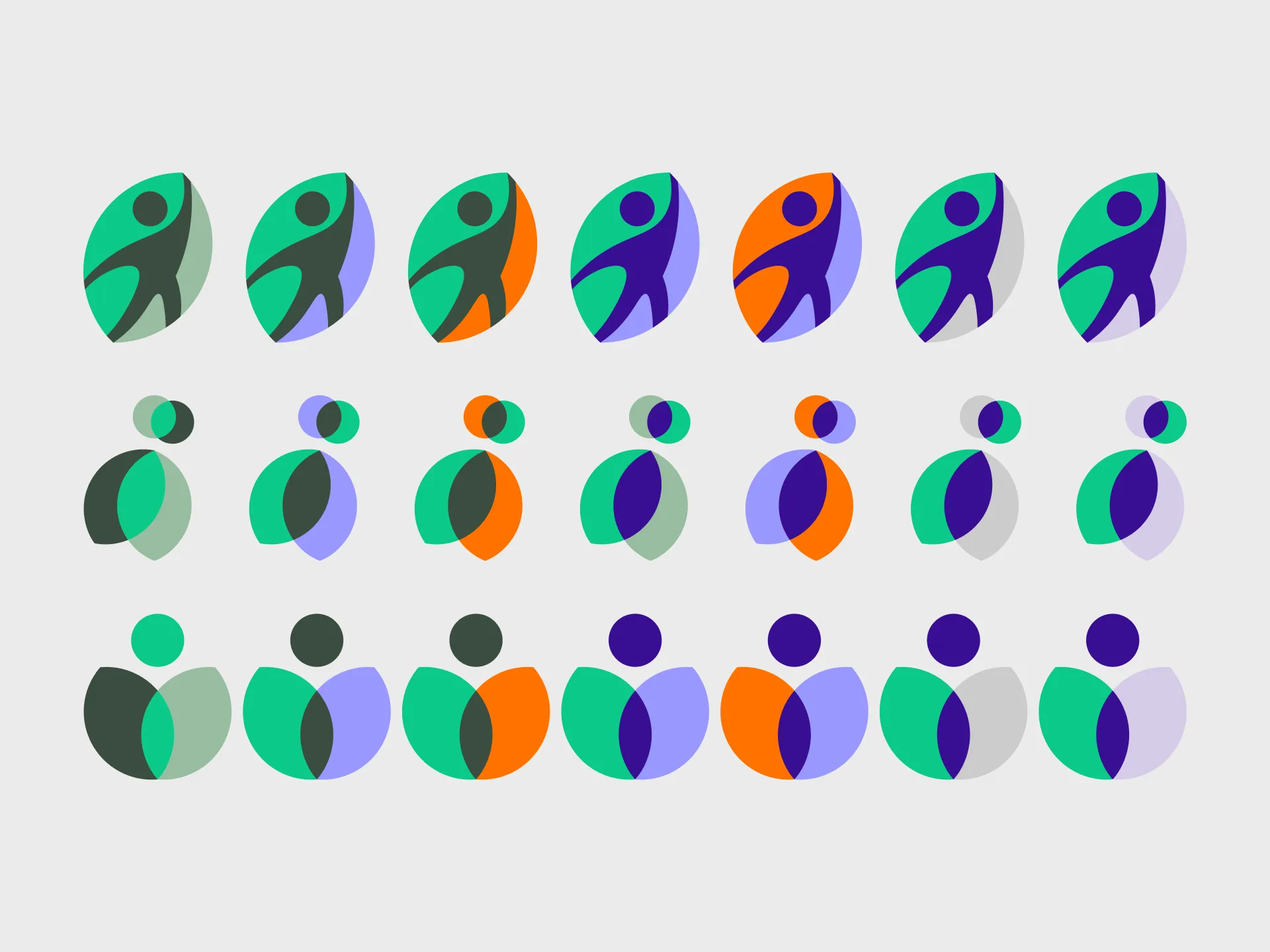
The project followed a structured iteration cycle: starting with an audit of existing RFH logos and brand marks to understand the visual system, followed by hand-sketched exploration to find the right conceptual direction. From there: refined composition and colour studies, a kitchen review, first and second drafts, and a formal presentation.
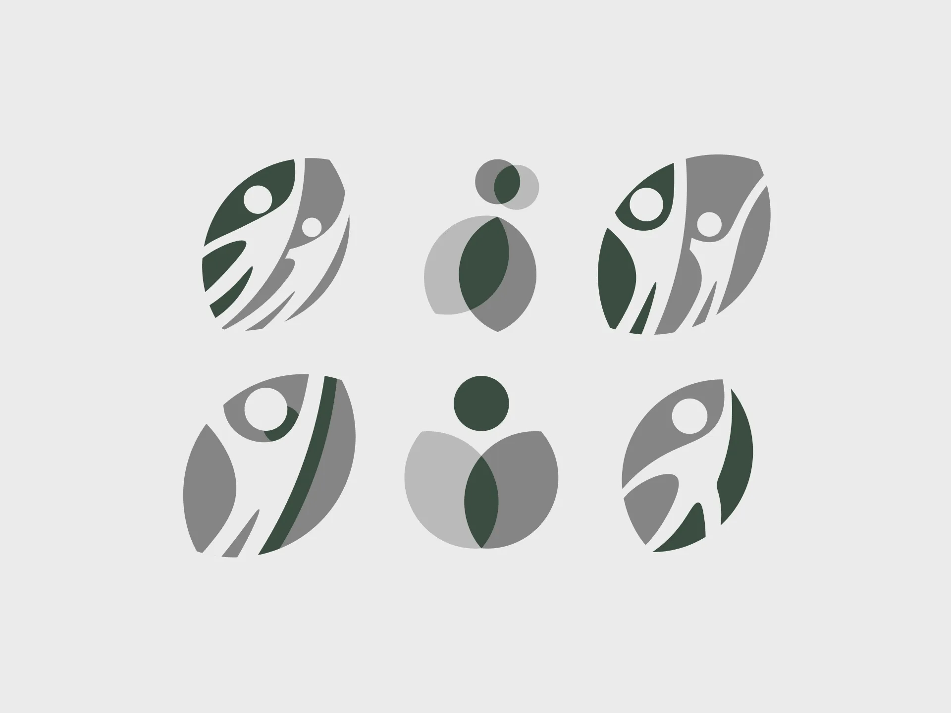
the design tension
The RFH parent brand is built on linework — precise, structured, botanical in reference. The design proposal for the staff association worked with filled forms instead: solid shapes rather than outlines. The reasoning was symbolic. Linework defines contour and structure. Filled form suggests substance, presence, the thing itself. Staff are not the outline of Royal FloraHolland — they are its content. The preferred concept carried that symbolism through a floral form that read simultaneously as growth, as bloom, and as the people at the core of the organisation.
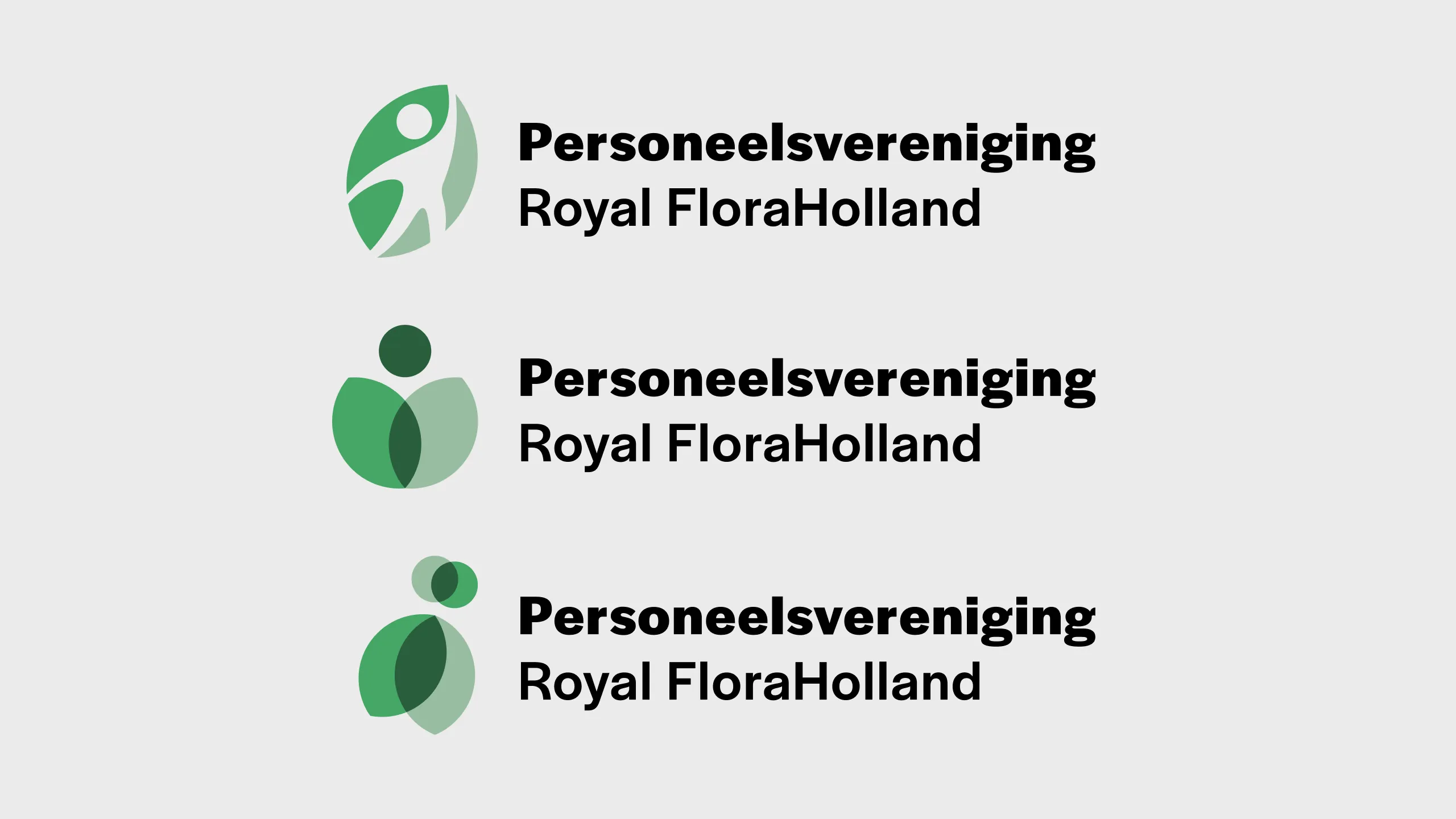
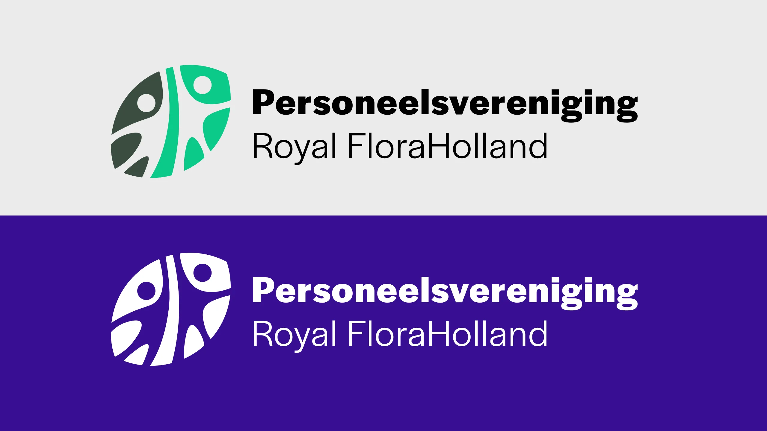
The client chose differently — a more direct, human-forward approach. That is a legitimate choice, and one the client is best placed to make. But the conversation around it was valuable.
→ Reflection: Clients know their organisation. Designers speak in visual language. Translating between those two fluencies — making the reasoning behind a design choice legible to someone who isn't trained to read it — is a skill I'm actively developing. This project was a good lesson in that.